Frame
<ns-frame> 
Overview
Frame provides a page navigation layout for specific contexts, like web apps (e.g. Customer account).
✨ This is an auto-generated AI summary of the ns-frame's documentation.
It may not be accurate. ✨
The ns-frame component comprises a header and buttons that are adjacent to an anonymous content area. When a button is clicked, it navigates through the content. This component should not be used in conjunction with the ns-header. It is particularly useful in scenarios such as when a user is logged into their account.
Examples
Guidance
Standard
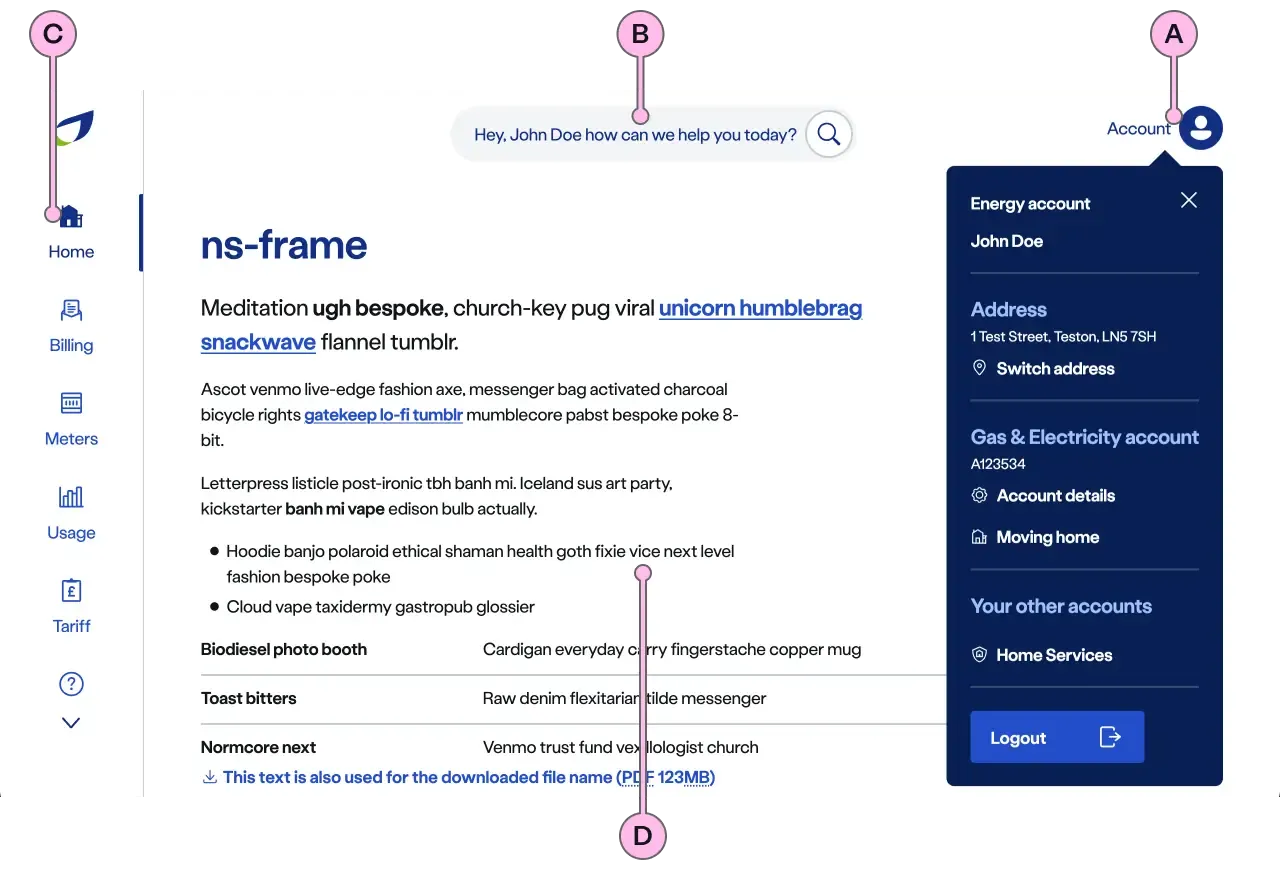
Key
| Key | Field type | Guidelines |
|---|---|---|
| A | Header | At the top of the page with the Search and Account buttons. Header can be presented with options like hide header, show search and hide menu. Refer to the Specification for how to use these options. |
| B | Buttons | Each button includes an icon and a label and an associated url. When the number of buttons exceeds the visible space, it becomes scrollable. There is an option to hide the buttons. Refer to the [Specification] (#specification) for how to use this option. |
| C | Menu scroll chevrons | These are interactive elements that provide visual cues and a method to navigate through the menu of buttons. This allows buttons positioned outside the visible area to be scrolled into view. These chevrons will automatically disappear if the number of buttons fits within the visible area. |
| D | Anonymous slot | To contain <ns-panel>. Pay attention to how the content displays at all resolutions. <nsx-footer> should be the last component. |
| E | Search | When Search is shown, it will contain the value of the name attribute, allowing for personalisation. Refer to the show-search attribute on how to use this option. |
| F | Menu | Include relevant account information in the menu that appears when the Account button is clicked. |
Implementation
Placement
The ns-frame component can only be used as a child of the <main> element.
Specification
Attributes
active-button
- Property
activeButton- Description
- The optional button index that needs to be selected by default.
- Type
number- Default
undefined
name
- Property
name- Description
- The account holder name that needs to be displayed.
- Type
string- Default
undefined
show-search
- Property
showSearch- Description
- The toggle to show search option in the header.
- Type
boolean- Default
false
hide-buttons
- Property
hideButtons- Description
- The toggle to hide the navigational buttons.
- Type
boolean- Default
false
hide-menu
- Property
hideMenu- Description
- The toggle to hide the menu in the header.
- Type
boolean- Default
false
app-view
- Property
appView- Description
- The toggle to indicate the usage of the component within the app.
- Type
boolean- Default
false
ignore-prefix-path
- Property
ignorePrefixPath- Description
- The path pattern to be ignored from the window location to match the button navigation link.
- Type
string- Default
buttons
- Property
buttons- Description
- The list of button objects. Each button has navigation link.
- Type
Array- Default
[]
menu
- Property
menu- Description
- The list of menu items that needs to be displayed in the navigation header.
- Type
Array- Default
[]
type
- Property
type- Type
string- Default
standard
Slots
| Slot | Permitted tags | Description |
|---|---|---|
| Anonymous slot | The anonymous slot for the content that needs to be displayed. |
Events
| Name | Description |
|---|---|
search-click | Dispatched when the search option is clicked. |
menu-click | Dispatched when the menu item is clicked. It holds the menu details. |
logout-click | Dispatched when the logout CTA is clicked from the account menu. |
button-click | Dispatched when the navigational button is clicked. It holds the button details. |
Specification notes
Buttons structure
[ { "icon" : "meter", "label" : "Meters", "url" : "/url/to/meter/page" } ...]Menu structure
[ { "label" : "Energy account", "data" : [ { "label" : "Address", "value" : "123 Kings Road, Townsville, AA12 3BB", "links" : [ { "label" : "Switch address", "url" : "/url/to/switch-address", "icon" : "location" }, ... ] }, ... ] }, ...]Last updated: